Microsoft Office software
03/21/201929003 3 comments
The Microsoft Office suite includes several products for full data processing - from the well-known Word and Excel to the less popular Access and Publisher. And although each application has its own purpose, some functions are duplicated: for example, you can insert a chart or histogram into a text document without opening a spreadsheet editor. Let's try to figure out how to do this.
Definition, types and purpose
A diagram is an image or graphical drawing that allows you to clearly see the relationship between several quantities.
Used to create reports and provide a more detailed view of differences in expenses, company income for the quarter, and increases or decreases in profits.
High-quality and appropriate use of these graphs allows you to simplify your document for perception, and also decorate it visually very well. Agree, it is much more pleasant to see the difference with the help of some beautiful graph than to endlessly look at black numbers in the text.
There are a variety of types, each of which may be best suited for displaying some specific data.
- “Exchange”, based on the name, was created to display the increase and decrease in exchange rates.
- Circular is great for seeing the biggest source of expense.
- A “bar” or “histogram” allows you to visually compare several different candidates in comparison. For example, using such charts, processors or video cards are compared and data is entered based on the test results of competing products.
And these are not all examples. In the program itself, I counted 17 different species, each of which has several more varieties. In general, for every taste and color.
Let's finally move on to considering the possibility of creating diagrams in Word using table data step by step. Let's start with the traditional 2003, and end with the more modern 2007, 2010, 2016 and so on.
Happy reading!
Creating diagrams in Word 2003
So, let's create a new text document for training. In it we are interested in the menu tab at the top of the “Insert” program window. We left-click on it and move the cursor over the “Drawing” drop-down menu item and select “Diagram” from it.
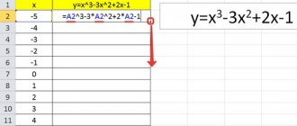
A histogram and a window with a data table will appear in front of us, into which you can enter your values and names of elements.
Look carefully at the table and the histogram to ensure you are entering the correct values in each cell.
To change this standard histogram to some other type, you need to click just below the graph itself, as in the screenshot below, and select “chart type” from the context menu.
A selection window will open in front of you, in which simply select the option that suits you and click “OK”.
At the end of the article, we will definitely look at the different types and their purposes, so be sure to read the article to the end!
After entering all the data and selecting the type, simply close the table window and admire the result of your work. To re-edit the table data, double-click on the resulting diagram with the left mouse button so that its area is outlined with diagonal dotted lines. After that, right-click in this area and select “table mode”.
After this, the data plate will appear again and allow you to edit it.
To edit the color of the columns, you need to right-click on the one you want to change and select “Format Data Series”. You can also simply double-click on it with the left mouse button. In the window that opens, you can configure the column in more detail.
The same goes for the background of the columns. Following the instructions above, you can change its color.
Now I propose to consider the possibility of creating diagrams from an existing data plate.
Create a chart from a table in Word 2003
Often there may be a need to graphically display ready-made data plates. In this case, you can try making an automatic chart based on the data.
For this we need an example table. I made a small 3x4 with random cost calculations.
As part of your workout, you can simply do exactly the same.
After this, select all the table cells by holding down the left mouse button and then perform the same actions as in the previous case.
We will see a histogram created that uses the data from the table.
So we’ve figured out how to build a diagram in Word 2003 step by step for dummies. Now I propose to consider this issue on modern versions of the office.
Paste directly
To make a graph in Word, you will need numerical data on the basis of which the graphic image will be built. How to create a chart: go to the “Insert” tab, in the “Illustrations” section, select “Insert Chart”. In the window that appears, select the type - histogram, line, petal or any other. Click “OK”, a template will appear and an Excel table below it with numbers for example.
Let's make a pie chart - enter your data into the table, the graph will change automatically. The first column is the labels of the categories, the second is their meanings. After finishing entering, close the sign using the cross button, the information will be saved and available for editing at any time.
Creating diagrams on modern office editions
To add them to the modern version of the office, you also do not need any special professional skills.
Go to the “Insert” tab, which is already familiar to us, and click on the “Diagram” button.
This will open the layout selection window. As I already mentioned at the beginning of the article, there are 17 of them here and each also has its own varieties.
Select a layout, select its type and click “OK”.
The chart we selected will appear on the sheet and an Excel table window will also open, into which you will need to enter data. Depending on the selected layout, the standard data format available in it will also differ. That is, it depends on the direct type of layout assignment.
At the top of the program window we can immediately pay attention to the settings. Here we can add an element, select an express layout, change colors, select a style, change data from a row to a column and vice versa, select data, change or change the format to some other one if the one you chose did not suit or did not like.
After finishing editing, simply click anywhere on the sheet to exit the settings mode. To edit again, double-click on any area of the diagram and you will be taken back to the settings. To change data, click the “Change data” button at the top of the window in the settings panel, and in this case the table editing window will open again.
First method: building a regular histogram
The construction begins by selecting an area of the table, the values of which will be displayed in the future histogram. Once the selection has been made, you need to go to the “Insert” tab. In it, you need to click on the “Histogram” button, which is located in the “Charts” area.
As a result, you will see a detailed list from which you need to select one of the diagrams. By the way, regular histograms are located first in the list.
After selection, the required option will appear in Excel, and at this point the construction can be considered complete. However, you can edit the histogram using the tools that are located in the group of tabs called “Working with Charts.”
Create a chart from a table in Modern Office Edition
Here we should make a small digression. I don’t know for what reason, but in modern versions it doesn’t work the way it did in 2003. No matter how hard I tried, I still had to enter the values manually. It’s better to make a table straight away using Excel in Word.
I described how to do this in one of the previous articles entitled “12 incredible ways to create a table in Word on all versions of Office”, I recommend that you read it.
If you already have a ready-made table in Word format, then you can simply build a diagram using the previous method. Then enter data or convert the current table into Excel format.
Parsing
Now I’ll show you how to build a diagram in Word 2010 using table data step by step.
First, let's create a small Excel spreadsheet for the sake of example. I made a small 3x4 with random cost calculations. Actually, this is the same tablet as in the case of the old version of Word, but in Excel spreadsheet format.
Since the Excel program itself has much more interesting capabilities in terms of creating charts, this will be even more convenient. Go to the "Insert" tab and you will see a large number of buttons for building.
Here the available types are sorted into categories, which are indicated by miniature icons. In this situation, I would prefer to simply select “Recommended charts” and let the application select the appropriate one. For our calculations, he chose several views, including a graph and a histogram.
I settled on the histogram, since I like it best for this kind of visual calculations. You can choose any other one, read the description and see the example. After making your selection, click the “OK” button.
After this, you will see the resulting result in the Excel workspace.
To exit the Excel interface, click on any free space in the Word sheet. To return to editing, double-click on the table with the left mouse button.
If there is no need to change the data of the resulting diagram, then I recommend selecting it as in the screenshot above (click on the area closer to the edge). Then copy (Ctrl-C or right-click and select Copy). Then exit Excel mode and paste (Ctrl-V or right-click and select “Paste”).
In this case, our histogram will be in the form of a picture and will fit more succinctly into the document. Take a look for yourself.
I recommend doing these steps only in the final formatting of the finished document, so that you don’t end up in a situation where you need to correct some data, but you no longer have a table, but just a picture. Keep in mind.
Import from Excel
If your data is stored in Microsoft Excel, you can create a chart there and then copy it into Word. The documents will be linked, and when the source data in the table changes, the appearance of the graphs will be automatically updated.
How to insert a chart from Excel:
- Click on the graph in Excel, select “Cut” or press Ctrl+X. The graphic image will disappear, leaving only the data.
- Go to Word, place the cursor in the desired location, click on “Paste” or Ctrl+V.
- Save the document. The next time you open it, select Yes to update the information.