Let's assume the user has data in absolute values. He needs to display the information on a diagram. For better clarity, it is necessary to show relative data values. For example, what percent of the plan was completed, how much product was sold, what part of the students completed the task, what percentage of employees have higher education, etc.
It's not that difficult to do. But if you lack Excel skills, some difficulties may arise. Let's take a closer look at how to make a percentage chart in Excel.
Pie percentage chart
Let's build a pie chart of the percentage distribution. For example, let’s take the official tax analytics “Receipts by type of taxes to the consolidated budget of the Russian Federation for 2015” (information from the Federal Tax Service website):
Select the entire table, including the column names. On the “Insert” tab, in the “Charts” group, select a simple pie.
Immediately after clicking on the tab of the selected type, a diagram like this appears on the sheet:
A separate segment of the circle is the share of each tax in the total revenues to the consolidated budget in 2015.
Now let's show on the diagram the percentage of types of taxes. Let's right-click on it. In the dialog box that opens, select the “Add data signatures” task.
The values from the second column of the table will appear on parts of the circle:
Right-click on the diagram again and select “Format Data Labels”:
In the menu that opens, in the “Signature Options” subgroup, you need to uncheck the box next to “Include values in signatures” and put it next to “Include shares in signatures.”
In the “Number” subgroup, change the general format to percentage. Remove the decimal places and set the format code to “0%”.
If you need to display percentages with one decimal place, set “0.0%” in the “Format code” field. With two decimal places – “0.00%”. And so on.
Standard settings allow you to change the location of labels on the diagram. Possible options:
- “In the center”—the labels will be displayed in the center of the segments;
- “At the top, inside”—the labels will be displayed on the inside of the circle;
- “At the top, outside” - the labels will appear on the outside of the circle; when you select this option, the diagram itself will be slightly smaller, but if there is small data, readability improves;
- “Fit to Width” - this option allows Excel to set the signatures in the most optimal way.
To change the direction of labels, in the Alignment subgroup, you can use the Text Direction tool. The angle of inclination is also set here.
Select the horizontal direction of the data labels and the “Width” position.
The pie chart with percentages is ready. The chart shows the percentage distribution of tax revenue.
How to edit information on a chart
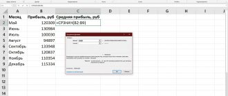
Of course, in the future you may need to rewrite the data in the chart you created .
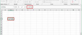
This is done very simply: left-click your mouse anywhere on the chart, as a result of which it will be selected. Then at the top of the utility window you will see that a new menu item has appeared called “Designer”. Click on it, find a button inside this tab called “Change data” and left-click on it with your mouse. Once again, the operating system will download Excel software for you, which will contain a table with the information necessary for constructing the graph. Enter the data you need into the appropriate cells and save it so that the chart is updated.
Column histogram
Let's add auxiliary columns to the table: 1 – with percentages (percentage contribution of each type of tax to the total); 2 – 100%.
Click on any table cell. Go to the “Insert” tab. In the “Charts” group, select “Normalized stacked histogram”.
An automatically generated diagram does not solve the problem. Therefore, on the “Design” tab, in the “Data” group, go to the “Select data” item.
Using the arrow, we change the order of the rows so that the percentages are at the bottom. The series showing absolute values is deleted. In “Categories”, remove the “Type of tax” cell. The title should not be a horizontal axis label.
Select any column of the created chart. Go to the “Layout” tab. In the “Current fragment” group, click “Format selected fragment”.
In the menu that opens, go to the “Series Parameters” tab. Set the value for row overlap to 100%.
As a result of the work done, we get a diagram like this:
This diagram gives a general idea of the percentage of tax types in the consolidated budget of the Russian Federation.
Charts help present numerical data in a graphical format, making large amounts of information much easier to understand. They can also be used to show relationships between different data series. A component of Microsoft's office suite, the Word text editor, also allows you to create diagrams, and below we will talk about how to do this with its help.
Important: Having Microsoft Excel installed on your computer provides advanced capabilities for creating charts in Word 2003, 2007, 2010 - 2016 and more recent versions. If the spreadsheet processor is not installed, Microsoft Graph is used to create charts. In this case, the diagram will be presented with associated data - in the form of a table into which you can not only enter your data, but also import it from a text document and even paste it from other programs.
Creating a basic chart in Word
There are two ways to add a diagram to a Microsoft text editor: embed it in a document or insert a corresponding object from Excel (in this case, it will be linked to the data on the source sheet of the spreadsheet processor). The main difference between these charts is where the data they contain is stored and how it is updated immediately after insertion. All the nuances will be discussed in more detail below.
Note: Some charts require a specific location of the data on the Microsoft Excel worksheet.
Option 1: Embed the diagram in the document
An Excel diagram embedded in Word will not change even when editing the source file. Objects that were added to the document in this way become part of the text file and lose their connection to the table.
Note: Since the data contained in the diagram will be stored in a Word document, using embedding is optimal in cases where you do not need to change this same data taking into account the source file. This method is also relevant when you do not want users who will work with the document in the future to have to update all the information associated with it.
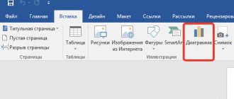
- To begin, left-click in the place in the document where you want to add a diagram.
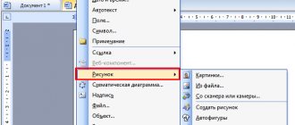
Next, go to the “Insert” tab, where in the “Illustrations” tool group, click on the “Diagram” item.
In the dialog box that appears, select the diagram type and appearance you want, focusing on the sections in the sidebar and the layouts presented in each of them. Once you have made your choice, click “OK”.
Replace the default data presented in this Excel window with the values you need. In addition to this information, you can replace examples of the axis label ( Column 1 ) and legend name ( Row 1 ).
After you enter the necessary data into the Excel window, click on the “Change data in Microsoft Excel” symbol and save the document using the “File” - “Save As” menu item.
Select a location to save the document and enter the desired name. Click the “Save” button, after which you can close the document.
This is just one of the possible methods by which you can make a chart from a table in Word.
Option 2: Linked chart from Excel
This method allows you to create a chart directly in Excel, in an external worksheet of the program, and then simply paste its linked version into Word. The data contained in an object of this type will be updated when changes/additions are made to the external sheet in which they are stored. The text editor itself will only store the location of the source file, displaying the associated data presented in it.
This approach to creating diagrams is especially useful when you need to include information in a document for which you are not responsible. For example, this may be data collected by another user, and he will be able to change, update and/or supplement it as necessary.
- Using the instructions provided at the link below, create a diagram in Excel and enter the necessary information.
Read more: How to make a diagram in Excel Select and cut out the resulting object. This can be done by pressing the “Ctrl+X” keys or using the mouse and the menu on the toolbar: select the diagram and click “Cut” (“Clipboard” group, “Home” tab).
In the Word document, click on the place where you want to add the object cut out in the previous step.
Paste the diagram using the “Ctrl+V” keys, or select the appropriate command on the control panel (the “Paste” button in the “Clipboard” options block).
Save the document along with the diagram you inserted into it.
Note: Changes you make to the original Excel document (outer worksheet) will immediately appear in the Word document in which you inserted the chart. To update data when you reopen the file after closing it, you will need to confirm the data update (button “Yes” ).
In a specific example, we looked at a pie chart in Word, but in this way you can create any other one, be it a graph with columns, as in the previous example, a histogram, bubble, etc.
Method 4: Online services
Not everyone has the need to download a program to their computer, much less buy it specifically to create a table with a diagram. In this case, online services come to the rescue, providing all the necessary functions for free. Let's look at the two most popular options.
Google Sheets
The first online service is designed for full-fledged work with spreadsheets in the browser, and all changes are saved in the cloud or files can be downloaded to your computer. Google Sheets makes it easy to create a percentage chart, save it to your account, or download it to your hard drive.
Go to the Google Sheets online service
- You will need a Google account, which you will need to log in to after clicking on the link above. Start working with a new document by creating it using the appropriate button, and transfer all the data that should be included in the percentage chart.
Change the chart layout and style
The diagram you created in Word can always be edited and expanded. It is not at all necessary to manually add new elements, change them, format them - there is always the possibility of using a ready-made style or layout, of which the Microsoft text editor contains a lot. Each such element can always be changed manually and adjusted in accordance with the necessary or desired requirements, and in the same way you can work with each individual part of the diagram.
Applying a ready-made layout
- Click on the chart you want to edit and go to the “Design” tab, located in the main “Working with Charts” tab.
Select the layout you want to use (Chart Styles group) and it will be successfully modified.
Note: To see all available styles, click on the button located in the lower right corner of the block with layouts - it looks like a line with a triangle pointing down below it.
Applying a preset style
- Click on the diagram to which you want to apply a pre-made style and go to the “Design” tab.
- In the Chart Styles group, select the one you want to use for your chart
- The changes will immediately be reflected in the object you created.
Using the above guidelines, you can literally change your diagrams on the fly, choosing the appropriate layout and style depending on what is needed at the moment. This way, you can create several different templates to work with, and then change them instead of creating new ones (we'll talk about how to save diagrams as a template below). A simple example: you have a bar graph or a pie chart - by choosing the appropriate layout, you can turn it into a chart with percentages, shown in the image below.
Manually changing the layout
- Click on the chart or individual element whose layout you want to change. You can do this another way:
- Click anywhere on the chart to activate the Chart Tool.
- In the “Format” tab, “Current fragment” group, click on the arrow next to “Chart elements”, after which you can select the required element.
- In the “Design” tab, in the “Chart Layouts” group, click on the first item - “Add Chart Element”.
From the drop-down menu, select what you want to add or change.
Note: Layout options you select and/or change will only apply to the selected element (part of the object). If you have selected the entire chart, for example, the Data Labels will be applied to all content. If only a data point is selected, changes will be applied exclusively to it.
Manually changing element format
- Click on the chart or individual element whose style you want to change.
Go to the “Format” tab of the “Working with Charts” section and perform the necessary action:
To format a selected chart element, select Format Selection in the Current Selection group. After this, you can set the necessary formatting options.
To format a shape that is a chart element, choose the style you want from the Shape Styles group. In addition to this, you can also fill the shape, change the color of its outline, and add effects.
- To format text, select the style you want from the WordArt Styles group. Here you can also perform a “Text Fill”, define a “Text Outline” or add special effects.
Saving as a template
It often happens that the diagram you created may be needed in the future, exactly the same or its analogue, this is no longer so important. In this case, it is best to save the resulting object as a template, thereby simplifying and speeding up your work in the future. For this:
- Right-click on the diagram and select “Save as Template” from the context menu.
In the system Explorer window that appears, specify the location to save and give the desired file name.
Settings
We figured out how to build a graph, now let's set up its display. If you need to change the values, right-click on the histogram and go to “Change data” in the menu. A table will appear, available for editing. Through the same context menu, you can change the type of chart, format of labels and series of values.
Tools for quickly editing the appearance appear on the right when you left-click on the chart. They will help you add or remove individual elements, apply a style, and customize the display of points.
For flexible chart setup, Word has 2 tabs: “Design” and “Format”. They appear in the menu when you click on the created chart. In the Design tab, create a unique look using ready-made Quick Layout templates, styles, and color schemes.
You can change the details of any fragment manually: click on the desired element of the graph and go to the “Format” tab. In the “Current fragment” section, select “Format selected fragment”; an additional menu will appear on the right. Draw your own style by changing the fill, borders, shadow parameters, effects. For text, you can change the outline, fill, and insert WordArt styles.
Excel
On your worksheet, select the data that will be used for the pie chart.
For more information about organizing data for a pie chart, see Data for Pie Charts.
On the Insert tab, click Insert Pie or Donut Chart, and then select the chart you want.
Click on the chart and then add the finishing touches using the icons next to the chart.
To show, hide, or format elements such as axis titles or data labels, click the chart element.
To quickly change the color or style of a chart, use Chart Styles.
To show or hide data in a chart, click the Chart Filters button.
What analysis of numerical data can be performed using them?
For graphical representation of numerical data
diagrams are used.
A chart is a graphical representation of numerical data
that allows you to quickly evaluate the relationship between several quantities.
Interesting materials:
When should a woman born in 1964 retire? When does the calendar year end? When does the school year end for first graders? When does the school year end in the Leningrad region? When does the school year end in St. Petersburg? Who will the tax office audit in 2022? Who will be called up from the reserves in 2022? Who will receive amnesty in 2022? Who will receive an additional pension from January 2022? Who will receive a pension increase in 2022 and by how much?
PowerPoint
Choose Insert > Chart > Pie and select the type of pie chart you want.
Note: If the screen size is reduced, the Chart button may appear smaller:
In the spreadsheet that appears, replace the placeholders with your own data.
For more information about organizing data for a pie chart, see Data for Pie Charts.
When finished, close the spreadsheet editor.
Click on the chart and then add the finishing touches using the icons next to the chart.
To show, hide, or format elements such as axis titles or data labels, click the chart element.
To quickly change the color or style of a chart, use Chart Styles.
To show or hide data in a chart, click the Chart Filters button.
On the Insert tab, click the Chart button.
Note: If the screen size is reduced, the Chart button may appear smaller:
Click the Pie button and double-click the desired chart type.
In the spreadsheet that appears, replace the placeholders with your own data.
For more information about organizing data for a pie chart, see Data for Pie Charts.
When finished, close the spreadsheet editor.
Click on the chart and then add the finishing touches using the icons next to the chart.
To show, hide, or format elements such as axis titles or data labels, click the chart element.
To quickly change the color or style of a chart, use Chart Styles.
To show or hide data in a chart, click the Chart Filters button.
To change the layout of the chart and text in your document, click the Layout Options button.
Data for Pie Charts
You can convert a spreadsheet column or row into a pie chart. Each chart segment (data point) shows the size or percentage of that segment to the entire chart.
Pie charts are best used when:
You only need to display one row of data;
the data series does not contain zero or negative values;
A data series contains no more than seven categories—a chart with more than seven segments can be difficult to understand.