Microsoft Office software
20.03.201928618
Spreadsheet editor programs simplify not only the collection and classification of data, but also the processing of mathematical expressions; in particular, they allow you to easily find the total amount or calculate the value using a formula. A user who already has an idea of how to freeze a row in Excel when scrolling will be able to build any graph. Let's try to figure out how to do this.
How to make a graph in Excel?
Excel allows you to draw a graph or make a diagram in several steps, without preliminary data processing and within the framework of the main package. There is no need to connect additional modules or install third-party plugins - everything that is required to draw a dependency is contained in the “ribbon”; The main thing is to use the offered functions correctly.
Important: working in MS Excel is not much different from using free editors. You can calculate percentages or create a graph in any of them by following the instructions below - you just need to slightly adapt it to a specific software product.
All the preparations that the user needs to make are to clarify the task and find the source data; Once everything is ready, you can launch Excel and get down to business.
simplest
The simplest graph in Excel is the dependence of one series of values on another. Drawing it is extremely simple: just set the parameters and make a few mouse clicks. Quite naturally, only one line will be displayed on the graph; if there are more, you need to go back to the beginning of the instructions and check the correctness of the actions taken.
To build a simple graph in Excel, you need:
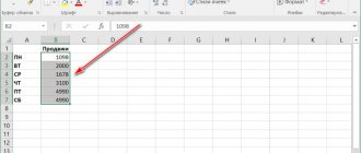
- Create a table of initial data. For greater convenience, interdependent values should be placed in columns with headings; In order to get not only a line on the graph, but also automatically labeled axes, you need to select not the entire table with the mouse.
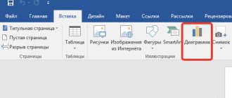
- Go to the “Insert” tab and, having found the “Insert graph” subsection in the “Charts” section, open the drop-down menu by clicking the mouse. The “Sparkline Graph” function presented next to the “Diagrams” is not suitable for building a simple dependence!
- In the list that opens, select the very first item, called “Chart”.
- The dependence built by the system fully corresponds to the entered data, but is not very well designed; how to correct the situation and make the visual presentation truly beautiful will be discussed in the corresponding section of our material. A picture can be moved, copied, pasted into a text document, and deleted by clicking on it and pressing the Delete key.
- If you want to build a simple graph with points, you should select the “Graph with markers” function in the same drop-down menu.
- Now, when hovering the mouse over any point, the user will be able to see the Y value for the X-axis mark in a tooltip.
Important: by clicking on a graph line or axis, the user will see which of the data series they belong to - the corresponding column of the source table will be highlighted.
With multiple data series
You can also draw a more complex relationship in Excel, including three, four or more data series. In this case, a simple graph will have as many lines as there are columns in the table (in addition to the main one, on which the others depend and which represents the X axis). As in the previous case, the graph can be “smooth” or with markers - it depends only on the needs and imagination of the user.
To draw a graph with several series of values, you need:
- Prepare and compile the table as before, placing the data in labeled columns, and then selecting the entire table, including the headings.
- Go to the “View” tab and select the “Graph” or “Graph with Markers” function in the drop-down menu, respectively - as a result, a dependence containing two lines for each series of numbers will appear near the table.
- If the values dependent on the first column are homogeneous (for example, income from the sale of goods of different categories), you can use the “Stacked Chart” function.
- Then in the final image you can see the total values for each position along the X axis.
Important: this option can only be used in the specified case - otherwise the constructed graph will incorrectly display the interdependence of the data.
- In this case, on the resulting line, when you hover the cursor, the value for the last row will be shown, and the total, without preliminary settings, the user will be able to look at the Y axis.
How to graph a function in Excel?
It was described above how to draw a graph in Excel if all interdependent data is already known; doing this is no more difficult than speeding up Windows 10 or understanding the video player settings. The user will have to do a little more work if they want to plot a function graph - they will have to first specify which formula the program should use to calculate the values.
To make a simple graph of a function in Excel, you need:
- Create a table with headings like X and Y or any other that allow you to trace the dependence of one series of values on another. Here you can immediately set several consecutive values for the X axis - independently or using automatic numbering.
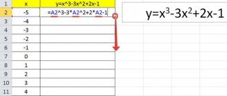
- Now you should move to the topmost cell under the second column heading, press the “Equals” key and enter the desired formula. The example will plot a parabola, that is, any Y value is equal to the corresponding X raised to the second power; for such a simple dependence, just multiply the adjacent cell by itself, and then press the Enter key.
- In more complex cases, it makes sense to go to the “Formulas” tab and use one of the functions located in the “Mathematical” section.
- You can build a graph of a parabola, like any other raising of Y to a power of X, by selecting the “Power” function in the drop-down list.
- Now all that remains is to indicate the initial value (the adjacent cell along the X axis), enter the required degree in the lower text field and click on the “OK” button.
- By selecting the cell with the calculated value and pulling down the cross located in its lower right corner, the user will finally receive the original correspondence table.
- To make the graph more “scaled”, you can change several extreme initial data along the X axis - the Y values will be recalculated automatically.
- Trying to draw a graph in Excel using the method described above, the user will encounter an unpleasant surprise: the X axis will “crawl” from top to bottom, not wanting to remain at the same level. The problem can be solved by selecting only Y values for constructing dependencies.
- The remaining manipulations do not differ from the previous ones: you need to go to the “Insert” tab and select the “Graph” or “Graph with Markers” functions in the “Charts” section.
- As you can see, the line connecting the points consists of separate segments and for a completely uniform parabola it looks unsatisfactory. To give the graph a familiar look, in the same section you need to select the drop-down menu “Insert scatter...chart” and in it - the function “Scatter with smooth curves” or “Scatter with smooth curves and markers”.
- The resulting graph will be smooth, since the intermediate straight lines in it are converted into curves.
- If there are a lot of specified values or you intend to supplement the graph with explanations and drawings, you should select the “Point” function in the same drop-down list - then only the corresponding markers will be displayed on the function graph.
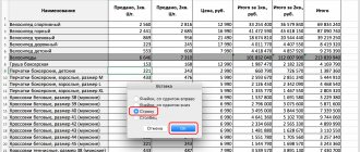
- It is easy to notice that the X axis in the image is labeled incorrectly. This can be corrected by selecting it (namely the axis, not the entire graph) with a mouse click and calling the “Select data” command in the context menu.
- In the window that opens, in the “Horizontal Axis Labels” column, click on the “Change” button.
- Now click on the upward-facing arrow located in the new window.
- By selecting the range of X values with the mouse pointer, which should become labels for the corresponding axis, and clicking “OK”, the user will see that the graph has already undergone changes.
- Next, you should confirm the correctness of the actions by clicking on the “OK” button again.
- You can see the correspondence between the graph and the axes by paying attention to the selected columns of the source table. When changes are made to the X series, the Y values are automatically recalculated, and the graph takes on a new form.
Creating a table and calculating function values
We have already built a table for the first function, let's add a third column - the values of the function y=50x+2 on the same interval [-5;5]. Fill in the values of this function. To do this, in cell C2 we enter the formula corresponding to the function, only instead of x we take the value -5, i.e. cell A2. Copy the formula down.
We received a table of the values of the variable x and both functions at these points.
How to build a dependency graph in Excel?
A dependency graph is essentially a function graph; we can only talk about the complexity of the mathematical expression; otherwise, the procedure for creating visual representations remains the same. To show how to plot a complex dependence of several parameters on the initial values, another small example will be given below.
Let the parameter Y depend on X in the form y = x3 + 3x – 5; Z - in the form z = x/2 + x2; finally, the dependence R is expressed as a set of unsystematized values.
Then, to build a summary dependence graph, you need to:
- Create a table in Excel with headings that reflect the essence of each dependency. Let, for example, be simply X, Y, Z and R. In this table, you can immediately set the values of the abscissa axis (X) and the parameter R, which is not expressed by a known function.
- Enter a formula in the top cell of the Y column, press Enter and “stretch” the values over the entire X range.
- Do the same for the Z column. As you can see, when you change any parameter X, the corresponding values of Y and Z will change, while R will remain unchanged.
- Select three columns of derivatives of X and construct, as described earlier, a graph - smooth, with markers or in the form of points.
- If one of the functions interferes with observing changes in the others, you can remove it from the graph by selecting it with a mouse click and pressing the Delete key.
Having learned how to build graphs in Excel, the user can move on to the next important task - trying to make the design of each dependence beautiful and rational.
conclusions
In simple terms, it is absolutely easy to create a graph using a specific range of values as a data source. Just press a couple of buttons, and the program will do the rest on its own. Of course, to master this instrument professionally, you need to practice a little.
If you follow the general recommendations for creating graphs, and also beautifully design the graph in such a way that you get a very beautiful and informative picture that will not cause difficulties when reading it.
Rate the quality of the article. Your opinion is important to us:
Features of the design of graphs in Excel
Some tips for designing graphs in Excel:
- The first thing the user should do is enter the name of the dependency correctly. To do this, you need to click on the “Chart Title” block, click on it again and enter the required name. If necessary, this block can be deleted by selecting it and pressing the Delete key.
- If you want to change not only the name, but also the writing style, you should select the block again, call up the context menu and select the “Font” section in it. Having selected the appropriate option, the user can click on “OK” and proceed to further actions.
- By calling the “Chart title format” menu, you can determine in which part of the picture the title will be located: in the center, in the upper left, lower right corner, and so on.
- To add axis names to the chart, click on the plus sign to the right of the figure and check the corresponding checkbox in the pop-up list.
- If the initial location of the names does not suit the user, he can freely drag them across the chart field, and also change their names in the manner described earlier.
- To add labels (placed directly on the grid) or data callouts (in separate windows) to any graph line, you need to select it by right-clicking and select the appropriate option in the “Add data labels” submenu.
- The user can freely combine methods of placing captions by selecting any of the items in the extended menu of the “Diagram Elements” window.
- By selecting “Advanced options” in the same menu, you should specify the category of the data presented in the side menu: prime numbers, fractions, percentages, money, and so on.
- To add a table with data directly to the chart, you need to call up the same “Additional parameters” by clicking on the plus sign and check the checkbox of the same name.
- Using the same menu, you can completely remove the grid, which allows you to find the graph values at each point, or add main and auxiliary markings to it.
- “Legend” is not the most useful, but a familiar block of Excel graphs. You can remove or move it by unchecking the box in the “Advanced Settings” window or by calling the submenu. A simpler option is to select a block by clicking the mouse and pressing the Delete key or dragging it across the chart field.
- The trend line will help you understand the general direction of the chart movement; You can add it for each row of values in the same window.
- By going to the “Design” tab, the user can radically change the appearance of the chart by selecting one of the standard templates in the “Chart Styles” section.
- And by calling the “Change Colors” menu located there, you can select a palette for each line individually or for the entire graph as a whole.
- The "Styles" menu of the "Format" tab allows you to find the optimal presentation for the text elements of the graph.
- You can change the background while leaving the chart type intact using the Shape Styles section.
- At this point, setting up the schedule can be considered complete. The user can change the chart type at any time by going to the menu of the same name and selecting the option he likes.
Inserting an additional axis
What actions need to be taken if we want to add another axis? For example, it is useful if you use several different data types or units of measurement.
The first stage is similar to the previous one. We need to build a graph in this way, as if all our data belongs to the same type.
11
After this, the axis to which the auxiliary axis will be added is selected, and a right-click is made. Next, go to the options “Data series format” – “Series parameters” – “Along auxiliary axis”.
12
After we click the “Close” button, another axis will appear on the graph, which describes the information of the second curve (in our example, the one in blue).
13
Excel also includes another method - changing the type of chart. In this case, first right-click on the line to which the additional axis will be added. After this, a menu appears in front of us, in which we are interested in the option “Change chart type for series”.
14
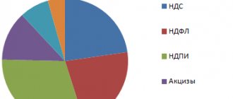
After this, we need to understand how the graph of the second data series will be displayed. In our case, we made a bar chart because it seemed to us that this method of presentation was the most convenient. But you have the opportunity to choose any other option.
15
As you can see, it only takes a few clicks to add another axis to the graph, which describes measurements of a different type.
Questions from newbies
Below you will find answers to the most frequently asked questions about plotting graphs in Excel.
What types of graphs are there in Excel?
The most popular types of charts were listed earlier; in total there are more than a dozen of them:
- simple;
- with accumulation;
- normalized;
- with markers;
- with markers and stacking;
- normalized with markers and accumulation;
- volume;
- with regions;
- with areas and accumulation;
- normalized with areas and accumulation;
- volumetric with areas;
- volumetric with areas and accumulation;
- normalized volumetric with areas and accumulation;
- point;
- point with smooth curves;
- point with smooth curves and markers.
Tip: the user can learn about the purpose of each type of Excel graph by hovering the mouse over its icon and reading a brief explanation.
How to add a line to an existing chart?
Add a new data sequence as a line to an Excel graph like this:
- Make appropriate changes to the original table.
- Right-click on the chart field and call the “Select data” item in the context menu.
- Click on the arrow next to the “Data range for chart” field.
- Select the entire table with the mouse, then click on the arrow in the dialog box again.
- A new line will appear on the chart; You can remove it by selecting it with the mouse and pressing the Delete key.