Round, stylish, real smart watch with a leather strap on my hand. A worthy rival to the familiar Apple Watch.
On the pages of iPhones.ru, my colleague talked about the first attempt of the South Koreans to create a revolution in the world of wearable electronics. Time and sales statistics have shown that the revolution did not happen: the appearance, functionality and price of Samsung Gear caused rather sluggish demand.
In the new generation of smart watches, the company decided to take a slightly different path: the Gear S2 and Gear S2 Classic watches, unlike their predecessors, appeared on the shelves, which looked suspiciously like classic chronographs.
The emphasis on the design of the devices indicates that Samsung has tried to smooth out the “geeky” perception of an electronic thing on the hand, which sometimes buzzes and seems to facilitate the dialogue between the user and the smartphone.
Appearance and features
For testing, I got the classic Samsung Gear S2 Classic model with a black genuine leather strap. Due to the fact that the strap is universal and removable, it can be easily replaced with any one you like. On the hand, the gadget looks like a good Swatch, discreet, but at the same time goes well with business suits and casual style.
Case material – stainless steel (316L), screen type – Super AMOLED with a diagonal of 1.2 inches and a resolution of 360x360 pixels (302 ppi). The watch is the standard of unisex style, and looks natural on both men's and women's hands (provided that the woman's hand belongs to a business housewife who wears formal skirts and gray cardigans). The dimensions of the device are 39.9x43.6x11.4 mm, weight - 42 grams.
Undoubtedly, smart watches from Samsung are interesting not only in appearance, but also due to the new way of controlling the device: the round bezel framing the screen acts as a kind of navigation joystick, by twisting which you can navigate through the menu, scroll through messages or change dials.
In addition to the ribbed bezel, you can control the watch using the touch screen and two physical buttons on the right side of the case. The top button takes you to the home menu, while the bottom button takes you back to the previous menu or screen. Between the buttons there is a microphone hole, which is needed for voice input.
On the back of the case there is a heart rate sensor and information about the watch model. The back cover feels plastic to the touch, after several days of wearing there is no irritation or allergies.
Here you can also look at the strap fastenings. The mounts are like those of an ordinary watch, metal rods. The watch is compatible with all kinds of standard straps (20 mm), which can be bought in watch stores.
The Gear S2 Classic is fully IP68 water and dust resistant. In theory, you can even swim in them, but I haven’t checked. And it’s a shame to get a high-quality leather strap wet.
The strong point of this gadget is the screen. It is bright and clear, the information is easy to read in the sun. In the watch settings, you can set the level or automatically adjust the brightness, plus you can configure it so that the time is displayed all the time, and not just when you raise your hand in a characteristic gesture.
⇡#Display
When the display turns on for the first time, it becomes clear that, despite its small size and not the highest pixel density, this is the best display among those generally installed on smart watches. It's all about Super AMOLED: it's not just bright, it's the brightest colors and truly black blacks. Moreover, the same Super AMOLED on a smartphone, Edge+, for example, is good, but not that good. Perhaps it's the bright lighting. Well, it’s just that AMOLED matrices look much more appropriate in watches than anything else. Black is very important here - it is the background of the system menu and all standard applications.
The display size is sufficient - not a competitor to the Moto 360, of course, but it’s convenient to work with what the watch can do. And they can do a lot.
Filling and functionality
The thin case fits 512 MB of RAM, 4 GB of internal memory (you can save music to listen to your favorite playlist while jogging, without a phone), as well as a dual-core processor based on the Exynos 3250 chipset with a clock frequency of 1 GHz. The Tizen operating system is battery-friendly and the watch can work for two days without recharging.
In addition to the Bluetooth module version 4.1, the device has a built-in NFC sensor for contactless data transfer, but you cannot connect third-party sensors, such as ANT+ or an external heart rate monitor.
The first generation Samsung Gear S watch could receive or make a call; the Gear S2 Classic no longer has this option. It is possible to dial a number, but you cannot talk by the clock. They say there is a special 3G version with which you can make calls, but I have not seen such a model, and they are not sold here, so - alas.
The functionality of the watch is excellent - more than 4,000 applications can be downloaded or purchased in a special store, which can be accessed through the Gear Manager program on a smartphone. Most of them turn out to be different variations of the dial design with varying degrees of information content, but there are also applications for popular instant messengers, various services and even games, just like in the Apple Watch.
Using apps, you can monitor your health, count steps, calories, and even the amount of fluid you drink per day. Moreover, all these counters are immediately built into the watch’s firmware. All basic functions, such as receiving messages, navigation, alarm clock, various social network notifications also work flawlessly.
Smartwatch Samsung Gear S2
In September, at IFA 2015, Samsung introduced the Gear S2 smartwatch. At the same time, we prepared the first review of this model, telling you in sufficient detail about the design and key features. Now, on the eve of the start of watch sales in Russia, the time has come to take a closer look at those aspects of the new product that were impossible to recognize and study under the conditions of the exhibition.
We outlined the history of the appearance of the Gear S2 and information about the Gear family as a whole in the already mentioned material, so we will not repeat ourselves and recommend that you read the article at the link before reading this text. However, at that time it was not yet known when the watch would be available in Russia and at what price. Now Samsung has released this information: sales should start this month (although the exact date has not yet been announced), and the price will be 21 thousand rubles for the regular version and 25 thousand for the classic version.
The pre-order, opened on the Russian Samsung website, was closed quite quickly due to the exhaustion of the first batch of devices, and the more expensive Gear S2 Classic was sold out first, but by the time the article was published, the regular Gear S2 had also run out. This, of course, indicates high interest in the new product, so it’s time to study it closely.
We tested the standard version of the Samsung Gear S2 with a dark gray body and a gray strap.
Let's take a look at the device specifications.
Specifications Samsung Gear S2
- CPU @1 GHz (2 cores)
- Touch round display 1.2″ Super AMOLED, 360×360, 302 ppi
- Random access memory (RAM) 512 MB, flash memory 4 GB
- Bluetooth 4.1 LE, NFC
- Wi-Fi 802.11 b/g/n
- Microphone
- Gyroscope, accelerometer, heart rate sensor, light sensor, barometer
- 2G, 3G (e-SIM support for Sport variant), call transfer to smartphone via Bluetooth
- Lithium-ion battery 250 mAh
- Tizen operating system
- Compatible with Samsung devices running Android 4.3 and later
- Degree of protection from moisture and dust: IP68
- Dimensions: 39.9 × 43.6 × 11.4 (Classic version) / 42.3 × 49.8 × 11.4 mm (Sport version)
- Weight 62 g (Sport version, our measurement)
For clarity, we decided to make a table with the characteristics of other top smartwatches (including the previous version of Gear S), adding into it those parameters that are currently key when choosing a device of this type.
| Samsung Gear S2 | Samsung Gear S | Motorola Moto 360 2 | Apple Watch | |
| Screen | round, flat Super AMOLED, 1.2″, 360×360 (302 ppi) | rectangular, curved Super AMOLED, 2.0″, 360×480 (300 ppi) | round, flat, IPS, 1.65″, 360×325 (290 ppi) / 1.8″, 360×330 (304 ppi) | rectangular, flat, AMOLED, 1.5″, 272×340 (290 ppi) / 1.65″, 312×390 (304 ppi) |
| Protection | yes (IP68) | yes (IP67) | yes (IP67) | No |
| Strap | removable, leather/silicone | removable, silicone | removable, leather / silicone / metal | removable, leather / silicone / metal |
| SoC (CPU) | 2 cores @1 GHz | 2 cores @1 GHz | Qualcomm Snapgragon 400, 4 cores @1 GHz | Apple S1, 1 core @520 MHz |
| Connection | 3G (Sport version only), Wi-Fi, Bluetooth | 3G, Wi-Fi, Bluetooth | Wi-Fi, GPS, Bluetooth | Wi-Fi, Bluetooth |
| Camera | No | No | No | No |
| Microphone, speaker | There is | There is | microphone only | There is |
| Compatibility | Samsung devices running Android 4.3 and later | Samsung devices running Android 4.3 and later | devices running Android 4.3 and later / iOS 8 and later | devices running iOS 8.3 and later |
| operating system | Tizen | Tizen | Android Wear | watchOS |
| Battery capacity (mAh) | 250 | 300 | 300 / 400 | not reported |
| Dimensions* (mm) | 40×44×11,4 / 42×50×11,4 | 40×58×12,5 | ∅42×11,4 / ∅46×11,4 | 39×33×10,5 / 42×36×10,5 |
| Weight (g) | 62 (Sport version) | 83 | doesn't communicate | 25 / 30 (Sport version)* |
*according to manufacturer information
We commented on this table in the first review of the Samsung Gear S2, so we won’t repeat it, but we note that there will be no 3G versions of the watch on official sale in Russia. The fact is that the Gear S2 uses a virtual SIM card format - e-SIM, but it is not yet supported by Russian operators. This is, of course, a minus compared to the Samsung Gear S, which used a regular Nano-SIM.
As for comparison with the Apple Watch, we note the lower price of the Samsung Gear S2 in Russia (if we compare the sports model with the Apple Watch Sport, and the classic model with the Apple Watch). But the Apple Watch has many more watch and band combinations available. That is, even if you have an Apple Watch Sport, you can buy a leather or metal strap for it, and vice versa, you can attach a silicone strap to the Apple Watch, while with Samsung the “watch/strap” ratio is strictly fixed (silicone - for the Samsung Gear S2 , leather - for Samsung Gear S2 Classic).
Well, let's move on to getting to know the device.
Packaging and equipment
The watch comes in a medium-sized square blue-gray box.
We open the box and see a watch inserted into a mold made of thin white plastic. It should be noted that although there are no complaints about the packaging, Samsung nevertheless approached this task formally. Unboxing the Gear S2 doesn’t give you any emotions (unlike the Apple Watch).
Under the plastic form are located: an additional strap of the same color, but of a different size, wireless charging 5 V 0.7 A, a charger with the same parameters (however, you can use any other smartphone charger), a small warranty booklet and a fold-out leaflet with instructions ( We had it in French, but it is obvious that the Russian version will be sold in Russia).
We were very pleased with the presence of an additional strap - moreover, there are both halves, and not just the one that has a different size. So if something happens to the main strap, one of the two halves can be replaced without any problems.
As for wireless charging, it is good for its compact size and the presence of a magnet inside the wall against which the watch rests with the back of the case. Thanks to this, the watch does not dangle or fall out of this miniature charger.
On the back of the round charging base there is a Micro-USB connector, to which the cable must be connected. Unfortunately, there is no way to connect the watch to a computer via this charger. On the front of the base you can see an LED indicator indicating that charging is in progress (red) or that the device is already charged (green).
In general, the package can be assessed positively: wireless charging and an additional strap are what were missing in the case of previous Gear models.
Design
We told you our first impressions of the design of the Samsung Gear S2 in the material from IFA 2015, and in general they did not change even after a closer look at the device. The watch looks minimalistic and moderately strict. In our opinion, they lose in comparison with the Gear S2 Classic, but the design itself leaves a pleasant impression.
The streamlined shape of the case and its smooth transition into the halves of the strap evoke associations with something futuristic - the “cool” design of the watch would fit perfectly into the interior of some space station. If we think in a more realistic manner, then the Samsung Gear S2 is quite suitable for different types of clothes (from casual to business style), but we cannot say that they will attract attention or become the highlight of your appearance. The design is too neutral or something.
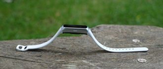
However, the watch fits well on the hand, and its case does not look thick. That's a plus. Here is a profile photo of the watch. Here it is worth paying attention not only to the thickness, but also to the presence of two buttons. The larger one is “Back”, the smaller one is “Home”.
Between the buttons you can see the hole for the built-in microphone - it is needed to work with the S Voice voice assistant, however, alas, there is no way to answer calls directly from the watch (there is no speaker in the watch). This is a disadvantage of the Samsung Gear S2 both compared to previous models of the Gear line and compared to the Apple Watch.
On the back of the watch case you can see the heart rate sensor (in the center) and clips for attaching the strap. To detach the halves of the strap, use your fingernail to slightly bend the clip away from the body and pull the strap down. At first it’s unusual, and it’s not immediately possible to understand how to detach the strap, but when you finally understand the essence of the fastening, then detaching and attaching is quite simple. And yet this mechanism cannot be called intuitive and elegant (unlike, again, the Apple Watch).
Well, the main design feature (common to both the regular and classic versions of the Gear S2) is undoubtedly the rotating bezel. In the watch industry, a bezel is a bezel on which traditional watches usually have notches for easy reading of the time. The Samsung Gear S2 does not have notches on the bezel, but it is possible to rotate it around the screen, thus either flipping through the screens or doing vertical scrolling (if such is suggested in the application).
In our first article about the Samsung Gear S2, we praised this solution, and after more thorough testing, our opinion has not changed. This is incredibly convenient, elegant both in concept and in appearance, and in addition, this becomes an additional weighty argument in favor of a round screen, since, obviously, such a solution would be impossible on a rectangular case. And here we again remember the Apple Watch, but not in favor of the product from Cupertino. We can say that despite such methods of interacting with the Apple Watch as Taptic Engine, Force Touch and Digital Crown, Samsung engineers were able to achieve more in making it easier to control the watch. Although, of course, the rotating bezel also takes some getting used to.
At the same time, an optimal combination of smoothness and elasticity of the bezel movement was found: the bezel rotates very smoothly, softly, without much effort, but accidental turns are almost excluded, and during rotation we clearly feel the divisions (“steps”).
Screen
The watch's screen is completely round, with no dead zones (unlike the Moto 360). The resolution is 360x360, which gives a fairly high density of 302 pixels per inch, close to its main competitors. Detailed testing of other parameters of the Samsung Gear S2 display was carried out by the editor of the “Projectors and TV” section, Alexey Kudryavtsev.
The front surface of the screen is made in the form of a glass plate with a mirror-smooth surface that is scratch-resistant. On the outer surface of the screen there is a special oleophobic (grease-repellent) coating (effective, noticeably better than that of Google Nexus 7 (2013)), so fingerprints are removed much easier and appear at a lower speed than in the case of regular glass. Judging by the reflection of objects, the anti-glare properties of the screen are no worse than those of the Google Nexus 7 2013 screen. For clarity, here is a photo in which a white surface is reflected when the screens are turned off:
Below on the right is the Samsung Gear S2, and on the right and above is the Apple Watch in the version with sapphire glass and a 42 mm case. The screen of the Samsung Gear S2 is slightly lighter (brightness according to photographs is 131 versus 125 for the Nexus 7). Note that there is a not very pronounced bluish halo from bright objects reflected in the screen. There is no double reflection, which indicates that there is no air gap between the layers of the screen. With manual brightness control and displaying the white field in full screen, the maximum value (10 on the scale) of brightness was about 330 cd/m², the minimum (1 on the scale) was 9.5 cd/m². There is a non-switchable automatic brightness adjustment based on the light sensor, which is supposedly located under the screen. With some difficulty, it was possible to establish that in a very bright environment (corresponding to lighting on a clear day outdoors, but without direct sunlight - 20,000 lux or a little more) the brightness increases to 495 cd/m². That is, given the good anti-glare properties, on a sunny day outdoors, screen readability will remain at a good level. In the graphs of brightness (vertical axis) versus time (horizontal axis) for high, medium and minimum brightness, only slight modulation can be seen, so there is no visible screen flicker:
This screen uses a Super AMOLED matrix - an active matrix on organic light-emitting diodes. A full-color image is created using subpixels of three colors - red (R), green (G) and blue (B) in equal numbers, as confirmed by a fragment of a microphotograph:
For comparison, you can see the gallery of microphotographs of screens used in mobile technology.
We observed a similar “structure” of the screen, for example, in the case of the Samsung Galaxy S4 mini smartphone. The spectra are typical for OLED - the primary color areas are well separated and appear as relatively narrow peaks:
Accordingly, the coverage is noticeably wider than sRGB, and there are no attempts to reduce it:
Note that on screens with a wide color gamut, without appropriate correction, the colors of regular images optimized for devices with sRGB screens appear unnaturally saturated. The color temperature of the white and gray fields is approximately 7600 K, and the deviation from the blackbody spectrum (ΔE) is 10 units. Color balance is acceptable. Black is just black from any angle. So black that the contrast parameter is simply not applicable in this case. When viewed perpendicularly, the uniformity of the white field is excellent. The screen has excellent viewing angles with a much smaller drop in brightness when looking at the screen at an angle compared to LCD screens. However, at large angles the white field takes on a certain blue-green tint. In general, the quality of the screen can be considered very high.
Smartphone connection and compatibility
All previous Gear devices only worked with a limited number of Samsung smartphones (mostly high-end models). This was perhaps the main drawback of Samsung watches and the Tizen OS used in them. And when it became known that the Android Wear operating system would work not only with Android devices, but also with iPhones, the limited compatibility of Gear devices became an obvious weak point.
Samsung apparently realized this too, which is why it announced that the Gear S2 will work with all Android smartphones running Android 4.4 and later. This is exactly what was said on the Russian pre-order page. But is it really so?
First we tried to pair the watch with the fairly new Huawei P8 Lite smartphone. There is a link on the watch box and on the start screen where you can download the application: apps.samsung.com/gear. When we access this page through a browser, we see two buttons: Galaxy Devices and Other Devices. Click Other Devices, the application page opens in the Google Play Store and...
... we read the inscription “Not supported on your device.” How so? Samsung representatives told us that in addition to Android 4.4, the smartphone must have at least 1.5 GB of RAM. This is already quite strange, since Android 4.4 works even on devices with 512 MB of RAM, which means that in fact not all smartphones running Android 4.4 are supported! But even this does not explain why the Huawei P8 Lite is not supported by the Gear Manager application, because it has 2 GB of RAM. Okay, attempt number two: Sony Xperia Z3 Compact. Here we were able to download everything, and it seemed like the connection process was even underway, but in the end we saw this amazing screen (see right screenshot).
That is, at the top it says that the Gear S2 is connected, and at the bottom it says that the Gear was not found. An obvious flaw! Repeated attempts to make friends between the two devices did not yield results. We won’t bore the reader with a detailed description, but let’s just say that the Gear S2 could not be connected either to the LG G4 Stylus (the watch started setting up the configuration, and the process froze), or to the Elephone P8000, or even to the Samsung Galaxy Xcover 3.
According to Samsung representatives, everything should have been operational by October 16, that is, by the start of global sales of the Gear S2. But it didn’t work. Therefore, if you are planning to buy a watch, be sure to go to apps.samsung.com/gear before purchasing and try downloading Gear Manager to your smartphone. This still doesn't guarantee anything, as we were able to verify, but at least at the time of purchase you can immediately check whether the watch is connected to your smartphone. But in general, it’s surprising that Samsung was able to afford such a flaw!
In the end, we managed to connect the watch only to the Samsung Galaxy Note5 smartphone, and here everything went like clockwork. Although there are some oddities here too.
Smartphone applications
The Gear Manager application required for operation was already installed on our test unit. However, in the process of connecting to the watch, the smartphone also wanted to download a certain Gear Plugin, apparently developed specifically for the Samsung Gear S2. All further work took place in this application (it’s not clear why Gear Manager is needed then).
The application menu is quite simple and generally familiar to us from previous watches in the Gear line. Here you can view and select watch dials (the same can be done directly in the watch, but choosing on a large smartphone screen is, of course, more convenient). If you're not happy with your current selection (we'll talk about pre-installed watch faces later), you can head over to the Gear Store to select paid watch faces.
The next item in the Gear Plugin menu is “Notifications”. Here we see a number of settings related to notifications: the choice of applications from which you can receive notifications, display features... In general, everything is standard. Next - “Application Management”. Here we see a list of applications installed on the watch, and we can change their order, including distribution across screens.
In the following paragraphs we see options for sending a media file to the watch (audio or image), as well as settings for some applications (as a rule, these are purely auxiliary settings).
At the end of the menu you can find a link to the Samsung Gear Apps app store, the “Find my Gear” option (send a command from your smartphone to make the watch vibrate) and additional settings.
Among the settings, an interesting feature is the ability to send an emergency message. You can specify contacts who, when you press the button on the Samsung Gear S2 watch three times, will receive an alarm message with your coordinates.
Watch interface and pre-installed applications
Now let's look at the interface and applications of the watch itself. Let's start with what the user will see most often: watch faces. In total, the watch has 14 dials, and all of them are designed specifically for the round screen (that is, these are not cropped square dials from other watch models on Tizen).
The dials, in our opinion, are beautiful. We will describe only a few of them, while the rest are also very good, there are practically no unsuccessful ones. So, first of all, let’s note the minimalist dials: on a dark neon background, as well as on a black background with a spectacular green circle (see screenshots above this paragraph). In addition, the animated dials are very good: on one there are neon sparkles floating, on the other there is a conventional image of a heart, the color shade of which depends on the last pulse measurement using the watch (the higher the pulse, the more saturated the color).
Of course, there are also all kinds of chronometers and digital menus. And among the unusual options, we were pleased with the dial with two circles, one of which displays the amount of time spent in a sitting position, and the other - your activity. Accordingly, the longer the activity lasted during the day, the larger the second circle will be. Visual and very motivating! At the same time, the minimalistic style of the watch is not violated.
To change the watch face without using a smartphone, just long press on the current watch face - and a ribbon of all available watch faces will open, where you can select the one you need. If we swipe the dial from right to left, we will see the main menu from which we can get to settings, open contacts, launch the S Voice voice assistant and open a list of all installed applications.
If you scroll further, you will see widgets for various applications: information about the number of steps per day, calendar, weather, music playback control (this screen looks like an elegant stylization of a vinyl record), results of the last heart rate measurement (by clicking on this widget you can start a new measurement) and a summary of different types of activity during the day. The last screen is to add widgets from other applications.
You can switch between widgets not only by swiping, but also by rotating the bezel. It's incredibly convenient! You can return to the watch face from any widget by pressing the Home button. And the “Back” button is very useful in the application menu - in order to move from one screen with icons to another.
Of course, in this menu the rotating bezel also turns out to be very useful: with its help we can quickly move from one icon to another by seeing the name of the application. And here we note a very important point: as you already understand from the appearance of the screenshots, the interface of the Tizen operating system, on which all watches in the Gear line operate, has been completely redesigned for a specific model. That is, if round watches on Android Wear (LG G Watch R, LG G Watch Urbane, Moto 360) use, in fact, the same version of the OS as regular applications (see our articles), then the entire interface of the Samsung Gear S2 was specially drawn specifically for a round screen, taking into account the advantages and limitations of this format. And it should be noted that it turned out very well: the interface is convenient, intuitive, and beautiful.
What else can a watch do and, conversely, cannot do? They can show information about traffic jams and the speed of travel to a selected address using Google Now.
They can show your current location and search for nearby objects (for example, parks) using Here maps. They also allow you to find the nearest public transport stop, but, frankly, the latter takes a long time and is actually of little use for real use.
There are also quite wide possibilities for working with SMS. In particular, you can send a response using one of the templates (you can edit the templates using a smartphone application), or send an emoji. The most interesting thing is that, if you wish, you can even type the answer on the virtual keyboard, although it’s hard for me to imagine a person who would actually do this.
In general, sometimes we got the feeling that the functionality of the watch was even redundant - in addition to the examples given, this is, say, the ability to dial a phone number on the watch. Are you seriously? Why, if you can’t call them anyway? Why not immediately dial on your smartphone if you still have to use it for conversation?
However, excess is not a deficiency. Moreover, the presence of these features does not overload the interface at all. In general, the set of pre-installed applications covers all the main tasks that are assigned to smart watches today. There are no revelations here, but there are also no things that are sorely lacking for those users who are familiar with other smartwatch models. Except for the ability to answer calls right on the clock.
If you still need something beyond the existing set of applications, you can turn to the range of the Samsung Gear Apps store. Alas, the choice here is small, mostly watch faces, and as for useful applications and games (the latter is very small), there are a lot of paid ones. Third-party applications must be installed via a smartphone.
Nevertheless, it’s worth a look at the store - even despite the modest assortment, you can find useful and pleasant things here. For example, a calculator from Samsung (yes, not all Samsung applications are pre-installed!) or a cute game made in the image and likeness of Flappy Bird (but a little easier, which is nice).
Let's hope the number of apps in the store optimized for the Samsung Gear S2 continues to grow. It is clear that there is almost no chance of catching up with Apple Watch and even Android Wear, but it is too early to talk about anything. Perhaps if the model is successful, developers will pay more attention to it.
conclusions
Well, after a more detailed acquaintance with the Samsung Gear S2, our first impression only intensified: this is indeed a very interesting, worthy device, which can rightfully be called one of the most successful smartwatches on the market. The main advantages include an interesting appearance, ease of use, largely due to an excellent discovery (rotating bezel), an interface fully optimized for a round screen, a large set of pre-installed applications and excellent watch faces.
It’s obvious that they tried; It's clear that they worked on a lot of details. It is even more strange that by the time the product was released, Samsung did not have time to provide the promised wide compatibility, which should have become another trump card of the device. We were never able to connect the watch to any third-party Android smartphone, and we have some doubts that Samsung will be able to solve this problem quickly and fully. That is, let’s say, there will be compatibility with the most famous flagship models, but with different “Chinese phones”?
Plus, it's not very clear how much the watch's functionality will differ when used with third-party devices. S Voice will not work, this is already known, but what else? When the Samsung Gear S2 Classic version goes on sale, we will try to return to this issue - let's hope that then the connection problems will be resolved. At the same time, we’ll figure out the battery life of the watch. So far we have not had the opportunity to get any long-term experience using the watch in real life to understand how long it will last under different usage scenarios (for example, with the screen always on or, conversely, in economy mode). Presumably, one charge will last from one to two days. But, we repeat, we will return to this later, since the model clearly deserves close attention.
One way or another, we congratulate Samsung on a truly bright and original concept (which is important!) product, which we boldly award with our Original Design award (previously the Samsung Gear S2 Classic version had already earned it), and not only for its appearance and controls, but also for the interface design.
Battery
The set includes a special charger – a docking station; the watch is placed on it. After 2.5 hours the battery is already full.
The battery life of 2-3 days declared by the manufacturer for the Samsung Gear S2 smart watch is quite achievable, it all depends on how actively you use the functionality. If you don’t turn off the gadget at night, leave reminders from social networks and light up the screen when they arrive, it will last about 2 days. The result is not bad, but the Samsung Gear 2 neo smartwatch takes the lead - up to 5 days under standard loads.
The power saving mode will help extend the operating time without recharging; when activated, the display turns black and white, most notifications do not arrive, and there is no pedometer.
Heart Rate Monitor and S Health
The heart rate sensor, located on the back of the Gear S2, uses green LEDs and a photosensor to detect the amount of blood in the veins, which changes as the heart beats.
Unlike previous versions of the Gear, the sensor works better, especially during sports. While running, the Gear S2 and the Suunto chest heart rate monitor didn't perform the same as expected, but the difference in data was small.
Heart rate monitor and pedometer data from the Gear S2 are collected in the proprietary Samsung S Health application, which is now also available for other Android smartphones.
In addition, in S Health on Gear S2, the user can start tracking running, walking, cycling, exercise bike, step trainer, elliptical trainer, as well as water and coffee consumption.
During training, the watch can track your distance (via a pedometer or GPS in your smartphone), as well as continuously measure your heart rate.
The watch warns with vibration and a message if the user does not move for a long time, and encourages him if he still decides to walk.
Interface
The Gear S2's interface is well designed and fits the round screen. If you swipe your finger across the display to the right or do the same with the ring, you can open a menu with application widgets, this can be quick access to settings and programs, weather, calendar, heart rate monitor and others.
If you swipe left from the main watch face screen, a menu with alerts will open. Here they will be collected and stored until the user reads them and deletes them.
A top-down gesture on the Gear S2 screen opens the status panel, which displays battery charge, smartphone connection status, as well as blocking notifications, quick access to player controls, and brightness adjustment.
Competitors
Samsung Gear S2 is the best device on Tizen OS, and its main competitor is Huawei Watch. It is a leader in its Android Wear platform. This watch offers a variety of applications that can be installed, maximum functions, and has a 1.4-inch screen with an excellent viewing angle. The display size here is larger, the price is higher - about 20,000 rubles... That is, Huawei Watc is inferior to the Gear S2 in design, but this is more a matter of taste than an obvious drawback, and in price.
If the manufacturer releases a program that makes it possible to connect to an iPhone, then Samsung Gear will become a clear competitor to the Apple Watch. Of course, the application will not fully support all properties, but its pleasant appearance and relatively low price, about 10,000 rubles, will play into the company’s hands.
Model design
Gear S2 Sports black
Gear S2 Sports white
Gear S2 Classic
As for the appearance, Samsung designers chose a fashionable and current style of minimalism and futurism for the Gear S2. There are no numbers or other indicators on the standard Sports model's display. The owner of the watch sees only a pair of white and red hands. However, anyone can change the display mode on the screen. The set will include a choice of white or black strap with standard fasteners, which allows you to replace them with any others.
Gear S2 Classic
Samsung also announced the release of the Gear S2 Classic. In terms of technical characteristics, these smart watches will be no different from their original Sports model. The difference lies in the design of the devices: for example, the classic model is more reminiscent of an ordinary wristwatch. The leather strap attracts attention and will add respectability to your image.
Strap
Samsung Gear S2 comes with rubber straps in two sizes. The latter do not cause irritation, leave a pleasant tactile sensation and hold the watch well on the hand.
However, it is important to note that the mechanism for attaching the strap to the Gear S2 body is proprietary. This means that you cannot connect standard straps to the watch; you will have to be content with branded ones.
Results
Let's see what pros and cons of the GIR s2 smartwatch can be highlighted.
| Why is it worth buying samsung gear s2 | Why you shouldn't buy Samsung Gear s2 |
|
|
The watch is convenient because it synchronizes with any device based on Android 4.4 and higher and with at least 1.5 GB of RAM; only voice functions will be missing, but not everyone needs them.
At the presentation of the Gear S3, Samsung announced that the S2 model will be developed and sold along with the new product. Therefore, if you choose the second option, you don’t have to worry that the manufacturer will stop supporting the device. In the future, a lot of updates and pleasant surprises are planned for watch owners.
Autonomy
The built-in battery capacity of the Gear S2 is only 250 mAh (300 mAh in the 3G model), but this is enough for two full days of watch operation, with notifications, pedometer, periodic heart rate measurement and display brightness set to 6 out of 10. not the most outstanding, but considering that most smartwatches need to be charged every day, this is a normal result. The Gear S2's battery drains within a day if you turn on continuous heart rate during a workout or if the watch is connected to Wi-Fi.
If the battery charge is at a minimum, and you won’t be able to get to charging in the next couple of hours, then you can activate the power saving mode on the Gear S2. It turns off notifications and background processes, and also switches the interface to black and white. But in this mode, a regular Gear S2 watch can work much longer.
The Gear S2 is charged via inductive charging, which magnetizes its metal case. A full charge takes approximately 1.5 hours.
Proprietary operating system
The sm r770 smart watch runs on the proprietary Tizen operating system, which has a positive effect on long-term autonomy. The manufacturer has achieved smoothness in its development, and this is an important criterion. Of course, there are also disadvantages. Android OS allows you to install much more truly necessary programs than Tizen.
Samsung Gear watches are not a competitor to Apple Watch, because synchronization with an iPhone does not work, and if this is done, only a couple of all the options will be available. iPhone owners simply cannot use the device, and they greatly regret it, because the Apple Watch is much more expensive.
Alerts
Using the Gear app on your smartphone, you can customize which alerts are shown on your Gear S2. They support the display of all notifications that can come to the smartphone, and some of them can even be responded to from the watch itself.
For example, the Gear S2 has well-implemented integration with Gmail; emails can not only be viewed or deleted, but also archived and replied to.
In the latter case, you can use previously prepared phrases, emoticons, or type the answer manually on a small keyboard.
⇡#Conclusion
Samsung is increasingly moving away from copying Apple - and this is good news. Yes, the icons are round, yes, the background is black, yes, the body is made of aluminum, but you can’t even attract attention anymore. A sleek design, a gorgeous round display, and - most importantly - an easy-to-use operating system populated with useful applications. Out of the box, the device can do everything that is currently available on smart watches of any level. Including on Apple Watch.
But like the Apple Watch, the Gear S2 is far from perfect. They, contrary to advertising, are not compatible with all devices running Android 4.4, they suffer from childhood problems such as “braking” volume and a constantly turning on screen, and applications not from Samsung - one or two are miscalculated. But it's still a very good smart watch. The only question is, do you need a smart watch as such? If yes, S2 definitely deserves attention, but if not, as they say, there is no trial.

