With each generation, iPhones are getting better: for Apple, this is a reason to attract new customers, and the owners of new products have their own reason to rejoice. A well-designed and convenient device will last several seasons before the need arises to replace your old phone with a new one.
In the case of the iPhone 12, introduced last year, the story is even more interesting. It turned out to be so successful and convenient that surpassing it and making the phone even better and more interesting is not an easy task.
Illustration: Svetlana Chuvileva / Wylsacom Media
Same design with new colors
Judging by my friends, people most often switch from an old iPhone to a new one as soon as a phone with a fundamentally new design comes out. This was the case when the iPhone 12 appeared - it became a long-awaited update. In the case of iPhone 13, you will get a new experience if you have not yet held the iPhone 12 in your hands. Otherwise, there will be no fresh emotions.
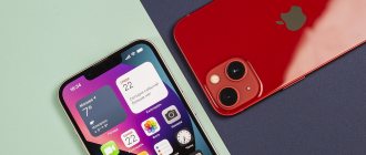
All the same dimensions, flat edges, aluminum alloy and glass on the back. What about the new body colors? Apple has reviewed the color palette and updated it. In my opinion, the range turned out strange and somewhat boring. It is not necessary to paint the cases in loud acid tones, but you want some variety, or something. Remember how bright and fresh the iPhone XR line was: rich yellow, coral, beautiful blue.
Please note that the iPhone 13 Pro case fits the iPhone 13 in size, but due to the larger cutout for the camera it looks very strange on it
Then there was the iPhone 11 in calmer colors, then the equally neutral iPhone 12. I thought maybe the iPhone 13 would somehow stir up the pastel kingdom, but no.
Basic white is good, but nothing new. The new black is terribly soiled, but at the same time it does not look like the usual black, rather, it is blue-black. Unusual color, but not for everyone. Judging by sales statistics, 7 out of 10 iPhones sold in Russia are black, and this color will have the greatest demand.
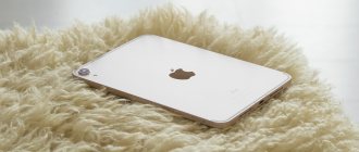
New iPad mini caught in the frame
For all my love for the color blue, I didn’t like either the dark blue of the iPhone 12 or the new shade of blue of the iPhone 13. The soft pink is very pale and can be easily confused with white in photographs. I would like to add saturation and make it brighter. Blood red Product Red looks good, but it’s not an option.
In general, I don’t presume to judge the Apple design team, but the color scheme is somehow unmemorable and strange. Or maybe it’s the blue color of the iPhone XR: how many years have passed, but it still looks very beautiful.
Still a very convenient phone
Like the iPhone 13 Pro, the iPhone 13 also has an increased size of the camera unit - the iPhone 12 case will not fit on it. Otherwise the body dimensions are the same, it's a little thicker, but it's still a phone that's easy to use with one hand. However, it is not heavy, unlike the iPhone 13 Pro, which, with comparable dimensions, feels like a much heavier device.
Of all the current generation iPhones I've tried, the iPhone 13 is my favorite. The miniature iPhone 13 mini is quite small and not very convenient for active work on the Internet. The iPhone 13 Pro has a decent weight - it feels like a heavy brick. There’s no need to talk about the iPhone 13 Pro Max, it’s simply huge. It was the iPhone 13 that turned out to be the most convenient and balanced: it is not big and not small, not thick and not heavy. The optimal phone for habitual one-handed use.
Wonderful screen
You can literally write one sentence about the display: everything is the same as in the iPhone 12, only the brightness margin has increased from 625 nits to 800 nits. Unlike the more expensive iPhone 13 Pro, 120 Hz support did not appear: we lived without it for so many years and I see no reason to worry.
The picture is bright, the colors are pleasant, the display frames are small - everything is fine. In this regard, both the iPhone 12 and 13 compare favorably with the old XR or 11, which no longer look modern compared to the new generations.
The reduced size of the “unibrow,” on the one hand, also deserves mention, but on the other hand, we don’t get any practical bonuses. Let's say it would be possible to add some symbols to the free space.
The frames of the iPhone XR are striking against the background of the new model
In addition, when using the phone, you don’t pay attention to the fact that the “bangs” have become smaller. The question here is whether it exists in principle, like on the iPhone, or whether it doesn’t exist, as the manufacturers of Android devices show.
Software
All new Apple iPhone 13 run Apple's iOS 15 operating system, which is not much different from iOS 14, although the interface elements have changed slightly.
The updates also affected FaceTime, Messages, the Safari browser (supports extensions), Wallet and Cards. Home screens can still be populated with the icons and widgets you want while other apps are in the library on the right home screen. Some of these screens can be hidden - for example, with games when you are at work.
iOS 15 introduced the Focus function, which allows you to switch between different modes: Work, Game, Sleep, Personal time and others. Other people will be able to see if you are currently available to chat, and the notifications you receive are limited. The feature also allows you to hide some home screens.
Widgets can be placed on any home screen, next to icons, their available sizes are 2x2, 4x2 and 4x4. Widgets of the same size can be placed on top of each other, after which iOS will either automatically select the top one, or you can do it yourself using swipes. This really saves space on iPhone 13 home screens.
The application library is analogous to the application drawer on Android; it cannot be removed. Located on the right home screen, all applications are added there immediately after installation and sorted by category. Sorting depends on the tags that developers assign after uploading to the App Store. The Today Screen remains for now, but is becoming less useful. You can place the same widgets there, as well as from third-party developers that are not optimized for iOS 15.
The notification panel opens by swiping from the top left of the screen, Control Center - from the right. Navigation gestures remain the same: swipe up from the bottom line and the application will close, from the bottom with a stop the task switcher will launch. Swipes on the sides perform the “back” and “forward” functions, when left or right along the bottom line - instantly switch between recent applications.
The iPhone 13 recognizes double and triple taps on the back of the case, which can be assigned any functions. The updated FaceTime has become more similar to Zoom, and in iOS 15 it supports viewing participants in a grid. Most importantly, it's now possible for more than just Apple device owners to participate in group calls—all you need is a Chrome or Edge browser.
Big changes in iOS 15 also affected the Safari browser - for example, you can quickly switch between tabs by swiping left or right along the bottom line. The address bar has moved down, and it hides while scrolling pages. Additionally, Safari now supports extensions, available for download and installation through the App Store.
Improved cameras: shoot especially well in the dark
The block with cameras sticks out from the body even more, and at the same time it takes up more space. Attentive people will also notice that the cameras are now located not one under the other, but diagonally. This is the main feature of the new iPhone 13, immediately distinguishing it from the iPhone 12.
The camera has become better compared to the iPhone 12, the main 12 megapixel module captures more light, and the additional wide-angle module with the same 12 megapixels has acquired autofocus and is better suited for shooting in low light conditions. But it can’t shoot macro like the iPhone 13 Pro does.
But the iPhone 13 received one of the cool features of last year’s flagship iPhone 12 Pro Max: optical stabilization with matrix shift. I really liked that now the night mode, when several frames are stitched together, is launched only in extreme cases. In most situations, the software does not succumb to the darkness, takes pictures quickly and does not require you to wait until the picture is taken.
This photo was taken in a very dark courtyard, but in fact you can’t tell that it was filmed in the dark
Photos taken late in the evening look very good. And this is without night mode
You can shoot even very fast subjects in low light
The wide-angle doesn’t work miracles at night, but the photos are definitely better than in the iPhone 12
The photo was taken in the same harsh night conditions. There is not much noise, the colors are reproduced accurately
Six lighting effects are available during shooting, and photographic styles have also been added. They differ from built-in filters in that they do not affect skin tone. It’s convenient that if you like one of the styles, then the phone can automatically apply it to the rest of the frames, without having to waste time on processing. In addition, the camera has become less yellowish; it’s hard to believe that warm tones are a thing of the past.
Porsche also produced tractors
The daytime shots are excellent. Even despite the gray cloudy weather
The camera produces excellent colors without manual processing
Smart HDR 4 works, it now recognizes up to four people in the frame and optimizes color settings individually. I tried it and honestly, I didn't feel much difference, but perhaps more experienced photographers will be able to see the differences.
The phone also has a special “Cinema Effect” mode when shooting video: you move the camera from one object to another, and the phone automatically changes focus. Moreover, this works both with people and with inanimate objects. It looks great, if you like to shoot videos with a creative approach, appreciate the new techniques.
The front camera remains the same, the quality is the same, but more options have been added: “Cinema mode” and photo styles for taking selfies.
Visual changes
There are only two of them:
- bangs are 20% smaller - actually not noticeable
- cameras are diagonal, and therefore old cases do not fit
It is important to know! The main camera sensor has become larger. Plus, the stabilization system due to the shift of the matrix itself, and not the lens, as was the case before, did not allow cameras to be placed one under the other. So the placement of cameras diagonally is justified. At least that's what Apple says.
The buttons slid down a little, the smartphone became a little thicker and a little heavier:
- 12: 146.7 x 71.5 x 7.4 mm / weight 164 g
- 13: 146.7 x 71.5 x 7.7 mm / weight 174 g
So there is no way to fit the old covers onto the new generation.
Even faster and more powerful
The iPhone 13 has the same new Apple A15 Bionic chipset as the more expensive iPhone 13 Pro, the only differences are in the graphics. The 13 Pro has five cores, while the 13 has four. I didn’t notice any difference in performance in games, nor in everyday use.
But now Apple has doubled the amount of internal memory: iPhone 13 is sold with 128, 256 and 512 GB of memory. Moreover, the price is the same as it was for the iPhone 12 a year ago.
Worth mentioning is the support for two eSIMs at once instead of one, as was the case in the iPhone 12. Plus we also get one physical SIM card. Thus, you have a choice: either two virtual SIM cards at once, or one virtual one paired with a physical one.
More for the same money
Last year you bought a 64-gigabyte “twin” for 79,990 rubles. Today, the 13th generation is sold for the same money, with 128 GB. There were no price increases, plus they added memory. Wonderful year! Wonderful Apple!
If anything, iPhone 13 prices around the world were discussed here. And now about the main thing.
Battery cases
I spent about six months with the iPhone 12, and overall I was happy with its operating time. It was not a record holder for autonomy, but when I used it, the charge most often lasted for the whole day, although sometimes I recharged it during the day.
Then I switched to the iPhone 12 Pro Max in the hope that the large phone would have a large battery and there would be no problems with autonomy in principle. As it turned out during use, there is a difference in favor of the Max, but not so critical as to put up with its huge size. If the iPhone 12 gave about 5.5-6 hours of active screen, then the 12 Pro Max - from 6 to 7, occasionally about 8 hours.
With the iPhone 13, the situation has changed for the better, autonomy has increased. According to Apple, it lasts 2.5 hours longer than its predecessor. According to my feelings, it lives exactly at the level of the iPhone 12 Pro Max: enough for a day. On average, there are about 7 hours of active screen time, which is decent by my standards.
Unboxing
The kit is like a real iPhone: a black box of not the best, but still of acceptable quality, a Lightning to USB Type-C cable similar to the original one, as well as a sticker with the phone’s serial number, which in theory should be firmly attached to the package.
In principle, if you know about phones and have seen original boxes for Apple products, you will immediately understand that you are holding something counterfeit in your hands. But if you have not had such experience, then you can mistake it for a real device.
The iPhone screen does not have the usual film covering the device on both sides - this also reveals the origin of the gadget. The fake is also visible from the round “128G” sticker on the screen—you’ll never see this on a real iPhone.
Should I buy an iPhone 13 or save money and buy an iPhone 12?
An eternal topic for discussion: should I buy a completely new model or stick with last year’s? I covered the topic in a separate text, you can read it here:
Looking for differences between iPhone 13 and iPhone 12
Alexander Pobyvanets
15 September 2021
After using the iPhone 13, I want to say that the capabilities of the new cameras make a very pleasant impression. Therefore, if you love taking photographs, then it’s definitely worth paying extra for the capabilities of the iPhone 13. And this is not counting its other advantages.
Video
Apple announced new video features for the iPhone 13, including a cinematic mode that can automatically change focus as objects move. The company demonstrated the mode's ability to "intelligently" shift focus from an object in the field of view to another object if it changes angle and looks in a different direction.
